Bradmarke | Branding, Advertising, and Marketing Solutions

Edit Content
Headquarter

Bradmarke Interactive, G.R.A, No. 60 Isaac John St, Ikeja GRA, Ikeja 101233, Lagos, Nigeria.

Bradmarke Interactive, No. 39 Ikot Ekpene Rd, Opposite Chicken Republic, Uyo, Akwa Ibom State, Nigeria.

Carrsly – Empowering Drivers, Connecting Investors

Building an unforgettable identity for a brand that simplifies car ownership for the ride-hailing industry.

Project Info

Brand Identity Development

Car-hailing is booming in Lagos, but for many drivers, the biggest challenge isn’t the driving—it’s getting the car. Enter Carrsly. They’re not just another app; they’re a platform that connects people who want to drive with investors who want to help. Think of it as a matchmaking service for cars—except with KYC verification and no awkward first dates.

Carrsly’s big goal was to make car ownership less stressful and more accessible for aspiring drivers, while keeping the process seamless and trustworthy for investors. But they needed a brand that reflected all of this: the heart, the innovation, and the sense of possibility they bring to the table.

Our mission? Give Carrsly a look and feel that screams trust, simplicity, and innovation—all wrapped up in a sleek, professional package. From a solid brand identity to everyday assets and some killer ads, we set out to make Carrsly impossible to ignore.

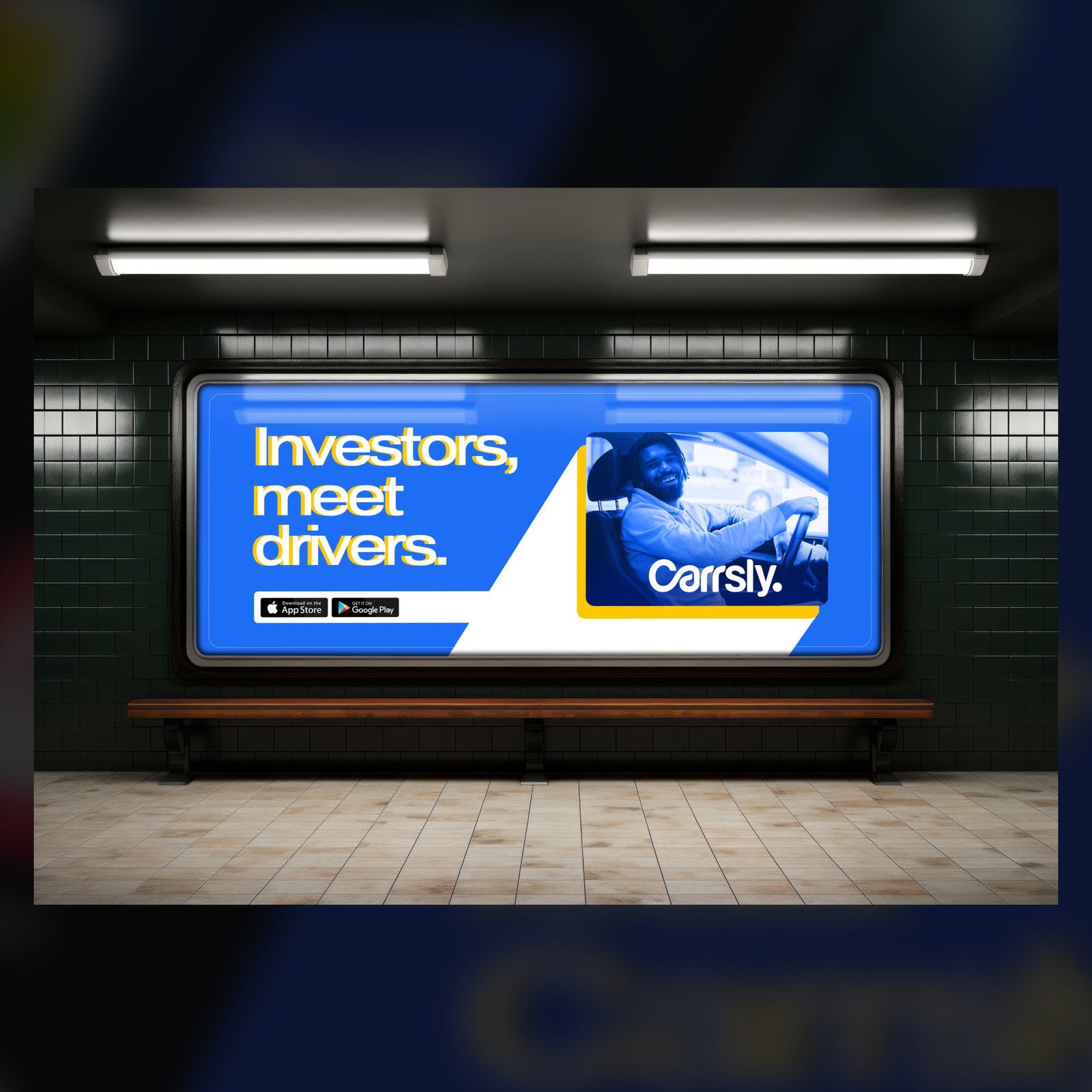
Carrsly’s all about opening doors—literally and figuratively. We wanted every piece of their branding to feel like an invitation: simple, approachable, and packed with potential.
Promise Akpan
Creative Director

Logo

Carrsly’s logo needed to hit the right notes: approachable, professional, and modern. We leaned into smooth, rounded typography and a sleek blue palette to nail down that perfect mix of trust and innovation.

  • The Rounded Font: It’s friendly, but not too casual—it says “you can trust us.”
  • The Blue Color: Blue is basically the color of trust and reliability, and it works perfectly for Carrsly’s investor-driver connections.
  • That Connected “C” and “a”: The letters literally connect, showing the seamless process Carrsly offers.
  • The Dot: Tiny but mighty—it represents precision, completion, and Carrsly’s role as the missing piece in the car ownership puzzle.


Brand Assets:

Consistency is key. We extended Carrsly’s brand into practical, everyday items that make them memorable and professional:

  • Water Bottles: Because even staying hydrated should look good.
  • ID Cards & Lanyards: These aren’t just for looks—they add a layer of professionalism and trust.
  • Jotters: A small but effective way to stay top-of-mind.
  • Laptop Stickers: Perfect for adding a bit of Carrsly flair to personal spaces.
  • T-Shirts: Comfortable, stylish, and great for making the Carrsly team and brand ambassadors stand out.

Spreading the Word: Ads That Work

What Carrsly Needed: Two big audiences:

  1. Drivers: People ready to take the wheel but stuck without a car.
  2. Investors: People with the resources but looking for reliable, verified drivers.
What We Did:

We created two ad campaigns that spoke directly to these audiences:

  1. “Download Carrsly” Campaign:
    This one was all about the drivers—simple, clear, and exciting. It focused on the ease of joining Carrsly and the opportunities it creates.

  2. “Investors Meet Drivers” Campaign:
    For investors, we emphasized trust. The ads highlighted Carrsly’s KYC verification process and the platform’s ability to connect them with reliable drivers.

Brand Identity Guidelines

Results

  • A 45% boost in app downloads in the first month after launch.
  • Increased investor inquiries, with many impressed by the seamless process.
  • Better brand recognition across social media and offline channels.

This rebranding captures everything we wanted to say about Glamora. It’s bold, it’s timeless, and it makes our clients feel like they’re part of something special.

Natalie Sinclair

Chief Marketing Officer, Glamora Collections

Related Projects

See how we’ve helped brands like yours stand out. Here are some other related projects.

Armen Construction wanted a bold identity to stand out and showcase its vision. They needed a brand that felt strong, timeless, and true to their commitment to quality.

We designed a logo, ads, and a brochure to bring it to life. 

Biyar Technologies builds cost-friendly, innovative software for businesses of all sizes. They needed a brand that reflected their bold, approachable vision.

We designed a professional identity, branded materials, and strategic ads to position them as a trusted software solutions provider.

QikFlux simplifies payments, transfers, and airtime purchases with speed and efficiency. To stand out in fintech, they needed a bold, recognizable identity.

We designed a dynamic logo and brand assets tailored to their tech-savvy audience.

Let's work together!

Your next big project starts here. Let’s make magic!