Bradmarke | Branding, Advertising, and Marketing Solutions

Edit Content
Headquarter

Bradmarke Interactive, G.R.A, No. 60 Isaac John St, Ikeja GRA, Ikeja 101233, Lagos, Nigeria.

Bradmarke Interactive, No. 39 Ikot Ekpene Rd, Opposite Chicken Republic, Uyo, Akwa Ibom State, Nigeria.

Biyar Technologies – Redefining Connectivity Through Custom Software

Building innovative, accessible software solutions for businesses of all sizes.

Project Info

Brand Identity Development

Biyar Technologies is a startup with a bold mission: to make innovative, cost-friendly software that businesses can actually use. Whether it’s a small business in need of a simple tool or a big corporation looking for a custom solution, Biyar is all about solving real-world problems with tailored technology.

But even the smartest solutions need the right branding to back them up. For Biyar, the challenge was creating a visual identity that matched their vision—bold, innovative, and approachable. They also needed branded materials and ads to help position themselves as a go-to for custom software solutions.

We set out to design a logo and brand assets that would reflect Biyar’s innovative spirit while staying professional and approachable. The goal was to craft a visual identity that communicated trust, creativity, and their focus on making technology accessible. On top of that, we developed ad campaigns to showcase their expertise in custom software development.

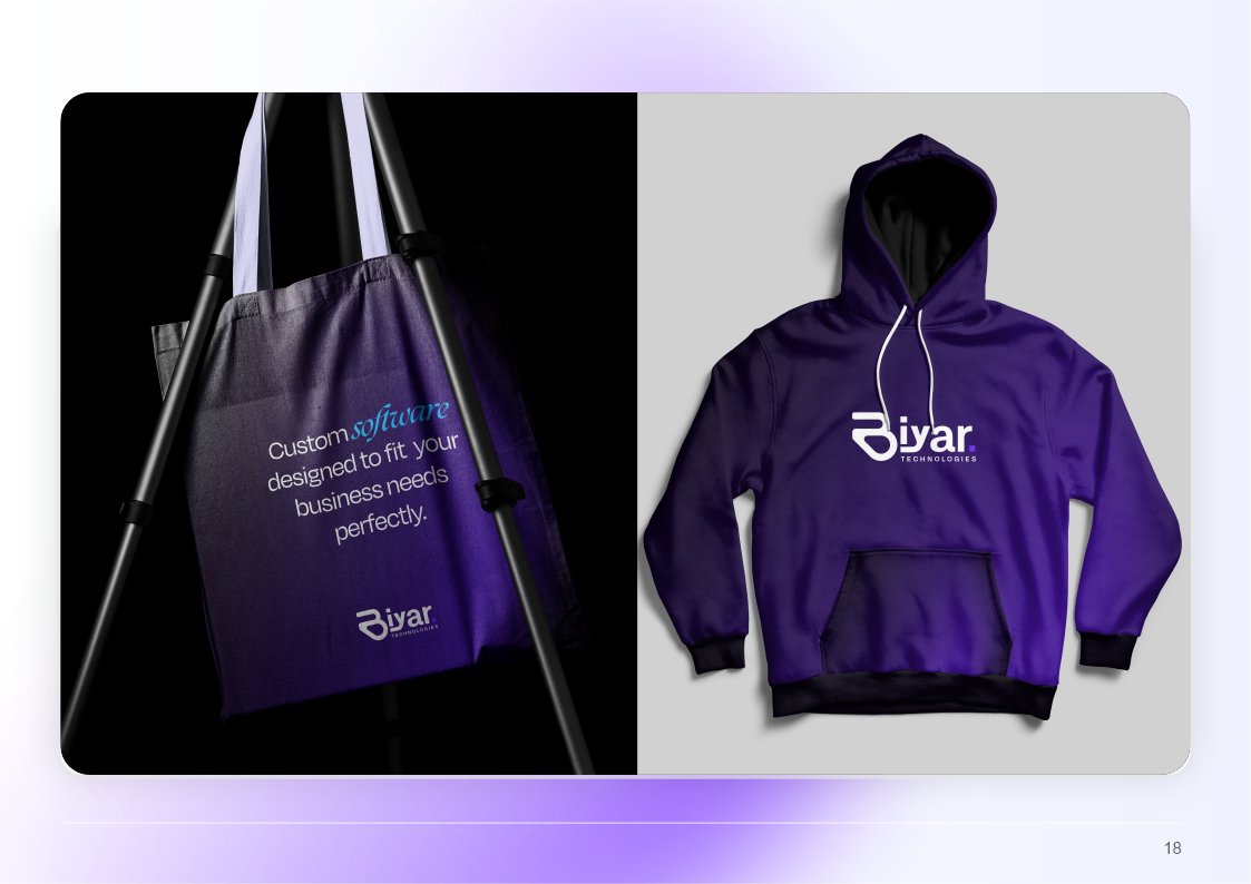
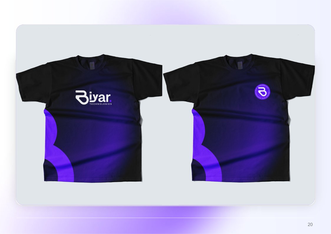
Biyar is all about taking the complicated world of software and making it accessible for everyone. We wanted their brand to feel as intuitive and smart as the solutions they build.
Promise Akpan
Creative Director

Logo

Biyar’s logo is simple, modern, and meaningful:

  • Typography & Icon: The bold “B” represents innovation and forward-thinking—a nod to Biyar’s mission of driving progress through technology.
  • Color Palette: The purple gradient embodies creativity and ambition, while the white reflects simplicity and ease of use.
  • Dot Element: A tiny detail with a big purpose—it symbolizes precision and Biyar’s ability to deliver targeted, effective solutions.
  • Minimalist Design: Clean and professional, it positions Biyar as trustworthy and customer-focused.

The Brand Assets:

We extended the Biyar brand into practical items that businesses would love to use, keeping the design consistent and visually appealing:

  • Business Cards & Letterhead: Clean, professional, and impactful—perfect for making a strong first impression.
  • Smartwatches: A modern touch that aligns with Biyar’s tech-forward identity.
  • File Holders & Tote Bags: Practical yet stylish, designed for both internal use and client-facing events.
  • T-Shirts & Hoodies: Comfortable and sleek, ideal for the Biyar team and brand ambassadors.
  • Water Bottles: A branded essential that’s both functional and visually striking.

Brand Guidelines:

We created a comprehensive guide detailing logo usage, typography, and color application. This ensured Biyar’s visuals remained cohesive across all platforms, reinforcing brand recognition.

Results

  • Increased brand awareness, with businesses reaching out for consultations within weeks of the campaign launch.
  • Strengthened Biyar’s position as a trusted name in the software development space, especially among small to mid-sized businesses.
  • Boosted social media engagement, with the ads receiving positive feedback for their clear messaging and appealing visuals.

This rebranding captures everything we wanted to say about Glamora. It’s bold, it’s timeless, and it makes our clients feel like they’re part of something special.

Natalie Sinclair

Chief Marketing Officer, Glamora Collections

Related Projects

See how we’ve helped brands like yours stand out. Here are some other related projects.

QikFlux simplifies payments, transfers, and airtime purchases with speed and efficiency. To stand out in fintech, they needed a bold, recognizable identity.

We designed a dynamic logo and brand assets tailored to their tech-savvy audience.

Armen Construction wanted a bold identity to stand out and showcase its vision. They needed a brand that felt strong, timeless, and true to their commitment to quality.

We designed a logo, ads, and a brochure to bring it to life. 

Villa Air, a Singapore airline, needed a fresh identity to attract travelers. We created a brand reflecting trust, innovation, and elegance.

Our team designed a logo, brand rationale, and materials for consistency. 

Let's work together!

Your next big project starts here. Let’s make magic!